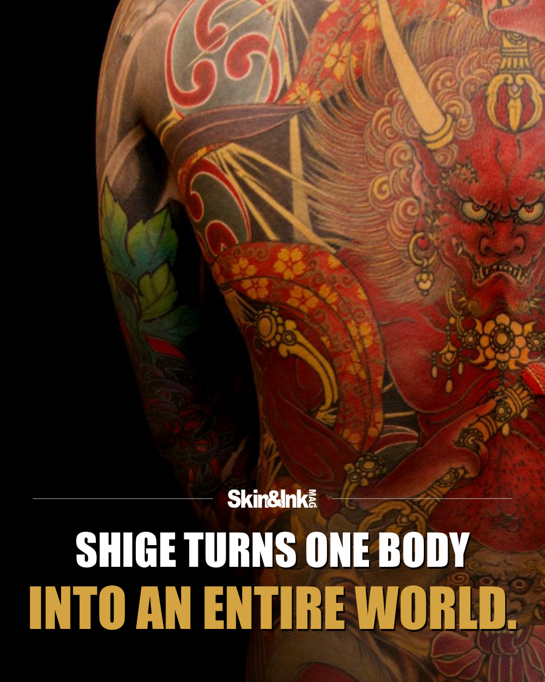
A Shige backpiece asks you to look twice. First you see the full arrangement: a figure, a creature, a broad movement of color. Then the smaller decisions start showing up. Armor, feathers, petals and clouds carry their own rhythms inside that larger image. The detail is considerable, but detail alone isn’t what holds these tattoos together.
The Yellow Blaze portfolio makes a stronger point about composition. In the selected bird work, large feather groups build a clear direction across the back. Individual feathers add texture, but they answer to the bigger movement. That hierarchy stops the image from becoming a collection of equally loud parts. You know where to look before you know everything you’re looking at.
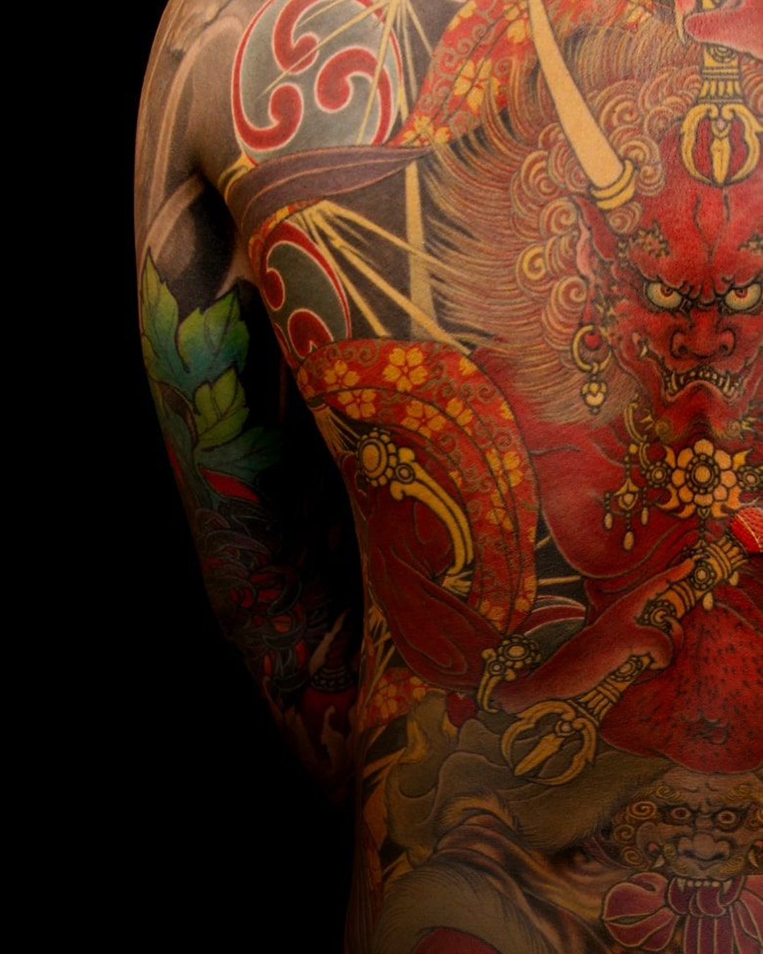
The figure-centered pieces work differently. A face can anchor the upper composition while garments, objects and surrounding forms extend the image toward the waist. The body provides the overall shape, and the tattoo works within it. Shoulders aren’t treated as square corners. They become part of the curve that holds the scene together.
Color does more than describe individual objects. Red can establish a forceful background or lead the eye toward a central figure. Cooler passages provide separation, while darker areas give the lighter shapes somewhere to stand out. Even where the surface is crowded, there’s an effort to keep the main subject legible. That balance is easy to underestimate when a photograph is reduced to the size of a phone screen.
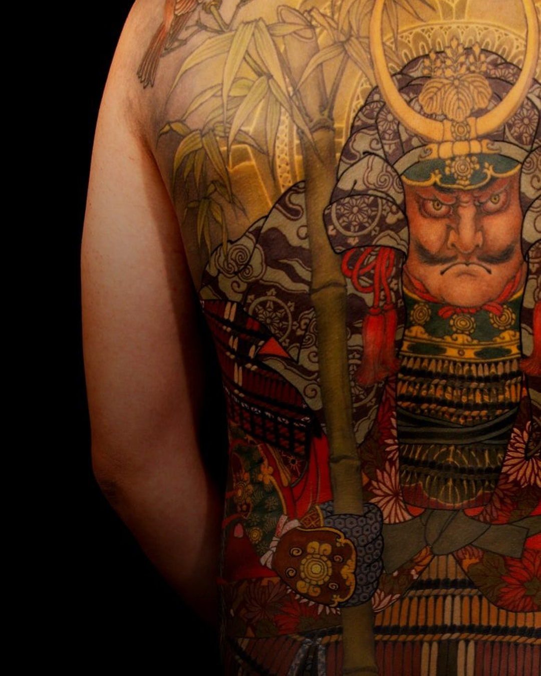
It’s worth slowing down for the transitions. A dense ornamental passage meets a larger field of color. A carefully modeled face sits beside a more graphic shape. Those shifts give the image breathing room without requiring large empty areas. The work can stay elaborate without asking every square inch to perform the same job.
The tiger and bird compositions also show why large-scale tattooing needs more than an impressive central subject. Surrounding forms establish pace and continuity. They help the design read as one connected piece rather than a dramatic animal surrounded by leftover space. The back is the organizing surface, not just the place where a finished picture happens to land.
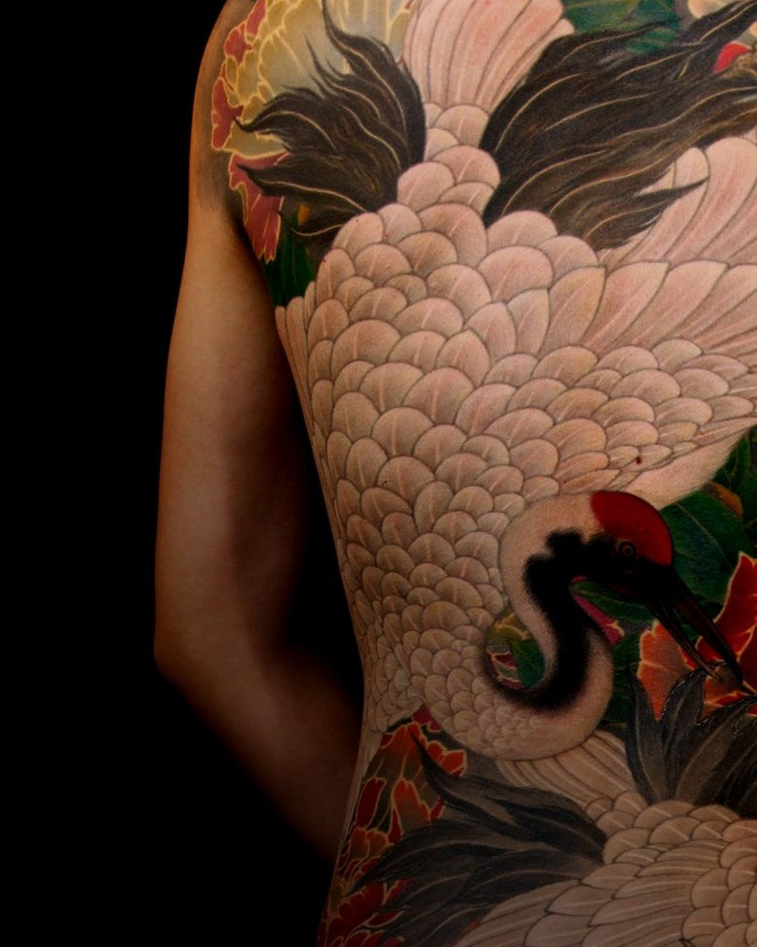
This selection isn’t a ranking of Shige’s most popular work. It’s a look at the visual choices that make the official portfolio compelling: strong primary forms, controlled changes of density and color that supports the whole composition. You can appreciate the work immediately, then spend time tracing how it functions. That’s the distinction. A backpiece can be full of images. Shige’s strongest compositions make those images feel like they belong to the same world.
Explore more from Shige on Instagram.