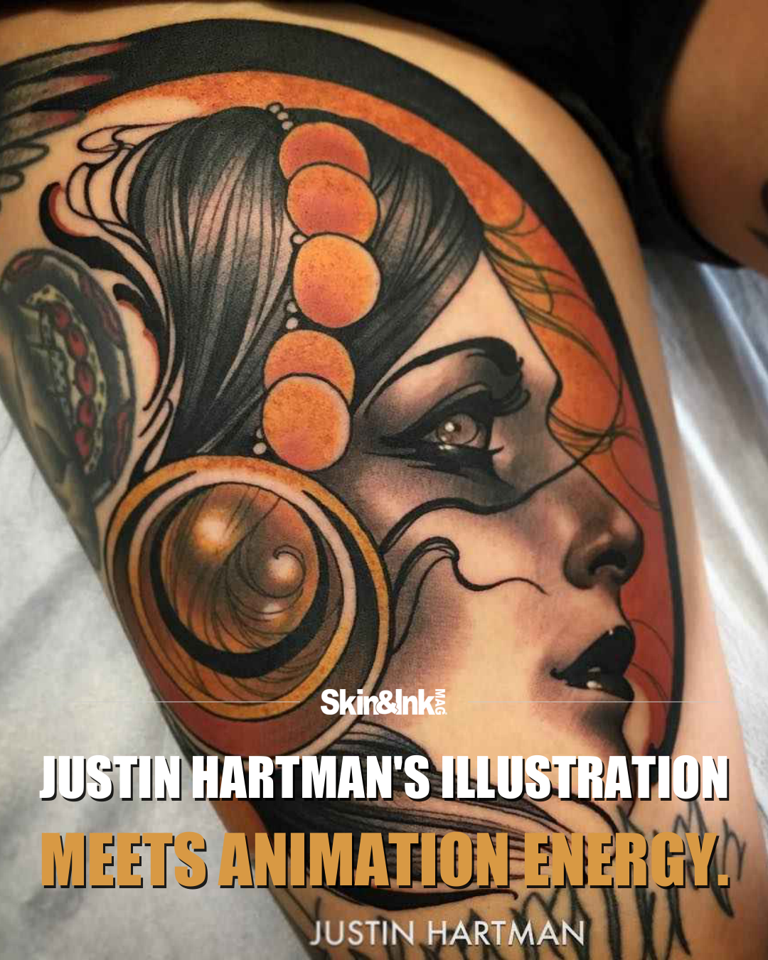
Justin Hartman's tattoos have the presence of characters, not just subjects. A woman in an elaborate headdress looks as though she belongs to a larger story. A skull feels theatrical rather than clinical. Flowers have weight and movement instead of behaving like filler. In this selection, the appeal is the way a strong illustration can suggest a whole world without spelling out its plot.
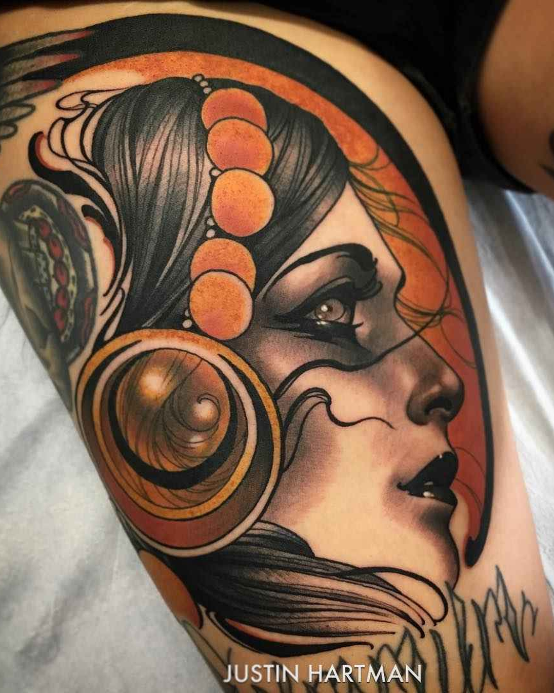
The orange-and-black profile is a good place to start. The curved shapes around the face make a bold silhouette, while smaller lines and highlights give the headpiece a mechanical, almost sculptural feel. The face stays calm inside all that activity. That separation matters. Hartman can build an intricate frame without letting it compete with the expression that first catches your eye.
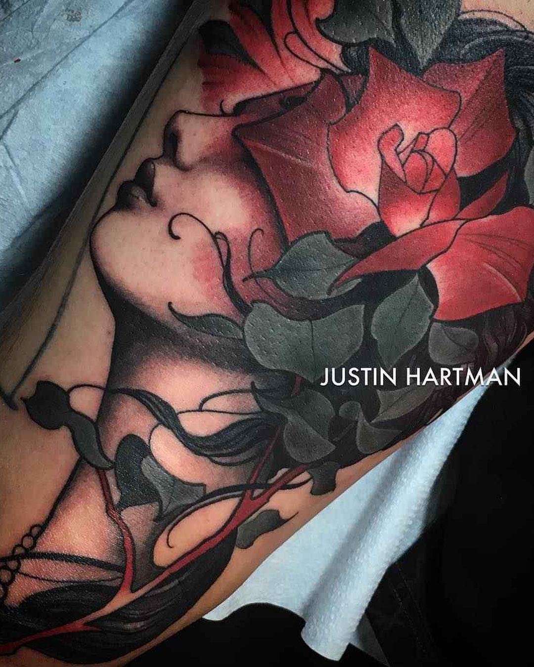
His color choices help hold those layers together. Warm oranges and reds sit beside quieter greens, cream-colored skin and deep black. They are not distributed evenly. A bright area becomes a focal point because there is enough restraint around it. The illustrated figures feel dimensional, but the work does not surrender its graphic clarity in pursuit of photographic realism. The drawing remains visible in the finished tattoo.
An iNKPPL profile published in 2016 described Hartman's earlier interest in animation and his move into tattooing. That background is a useful connection, not a rule for reading every image. The visible work has the kind of controlled exaggeration that makes a character memorable: a sharpened profile, an expressive hand, a costume element that carries as much personality as the face. It feels designed to communicate quickly and then reveal more.
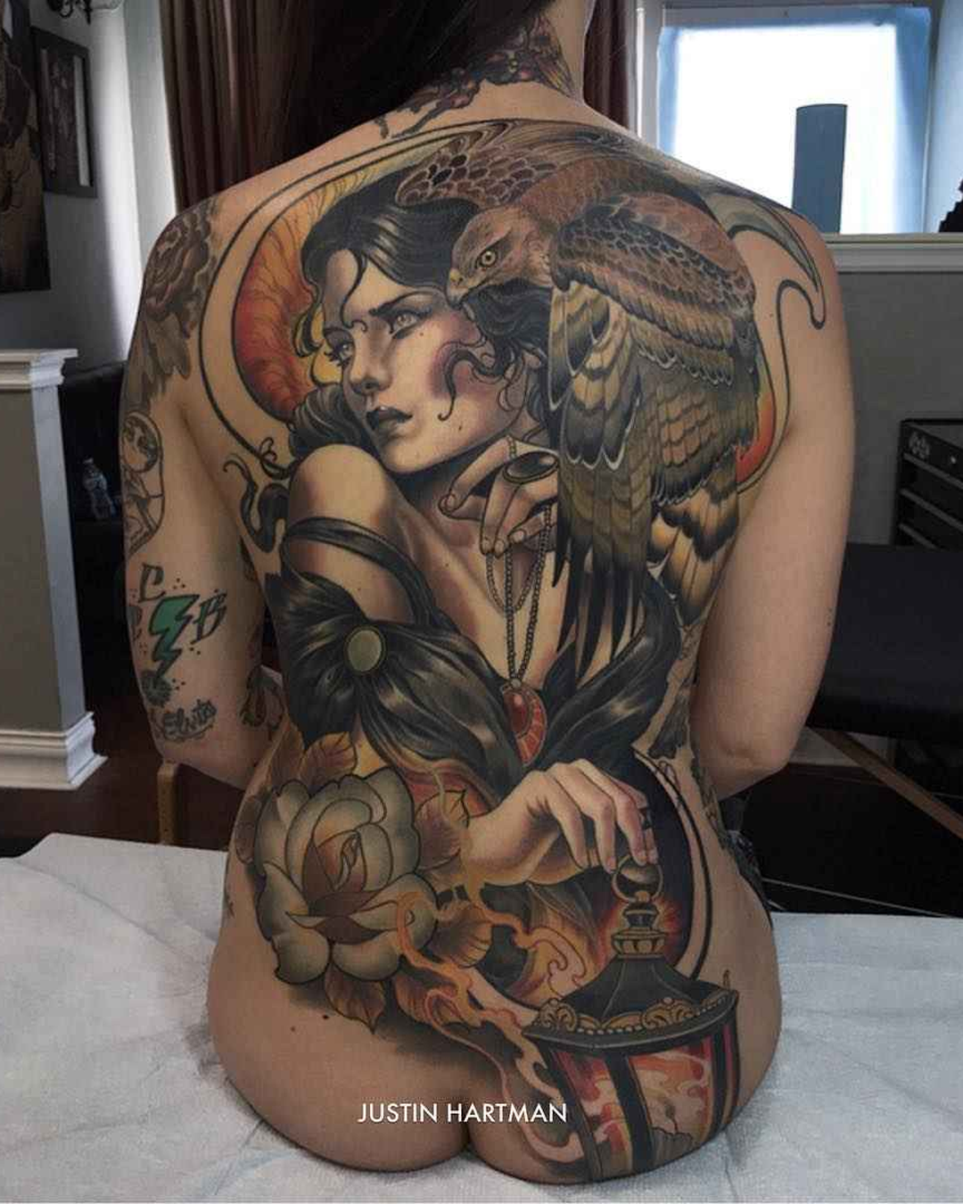
The larger compositions show how that language expands. On a back, the surrounding flowers and decorative forms become part of the structure rather than a border added at the end. On a limb, an elongated figure can follow the available space while keeping a clear visual center. There is a lot happening in some of these pieces, but the darker shapes give the eye a route through them.
What stands out is the balance between polish and character. The finish is controlled, yet the subjects do not feel scrubbed of personality. There is room for a dramatic gaze, an unusual headpiece or a strange collision of beautiful and unsettling imagery. Hartman's tattoos make the case for illustration as a complete tattoo language: strong enough to read immediately, specific enough to feel authored, and layered enough that one glance never quite finishes the job.
Explore more from Justin Hartman on Instagram.