Jun Cha’s tattoos can look heavy without relying on a heavy outline. Faces, bodies and folds of fabric emerge through changes in value. Light catches a forehead or shoulder, then drops into a darker passage beside it. The effect brings sculptural volume to skin, but the work still has to solve a tattoo’s central problem: making an image read on a body that moves.
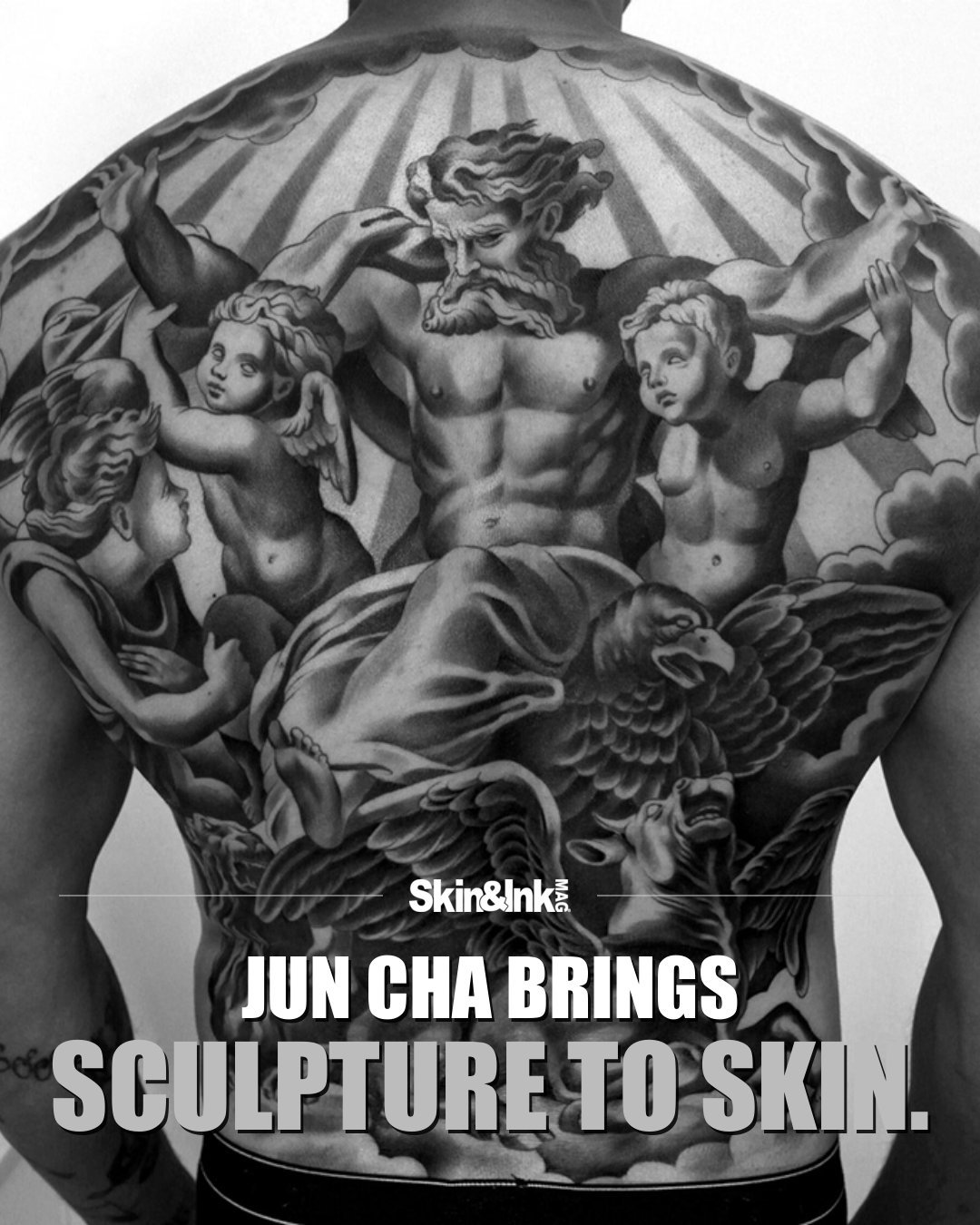
The selected full-back composition shows that challenge at scale. Several figures share the space, with large gestures establishing the main structure. Smaller forms fill out the scene, but they don’t all compete equally. The grouping gives the eye a route through the image. You can read the broad arrangement before trying to separate every face, limb and fold.
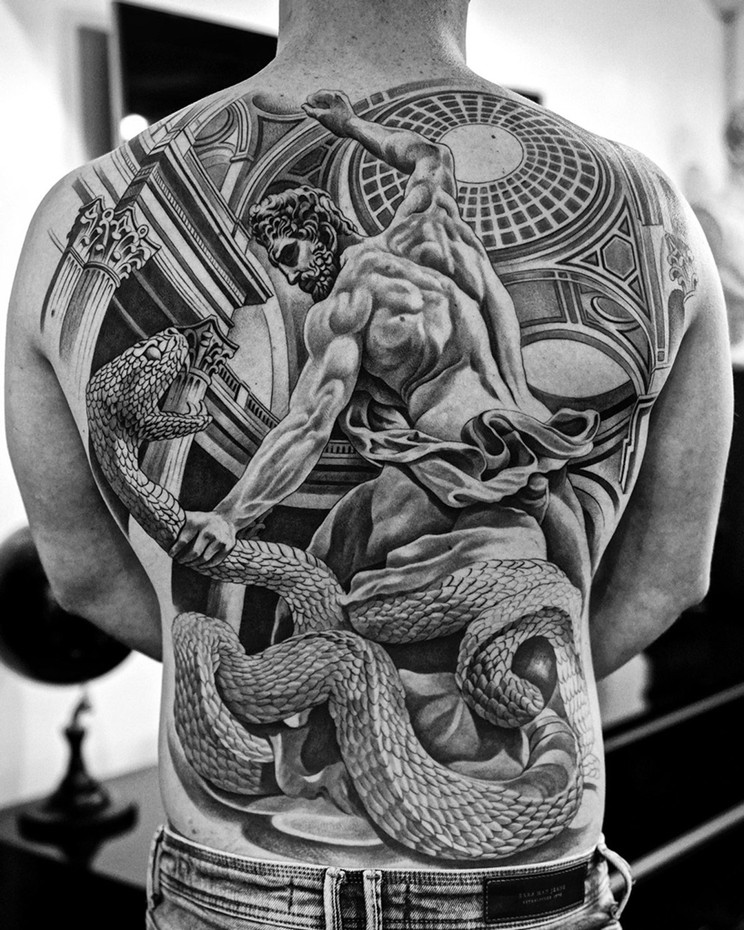
Another backpiece uses a different balance, bringing a large figure together with patterned and architectural-looking elements. The contrast between those surfaces matters. Organic forms have a softness that the surrounding structures don’t. Placing them together makes each quality more visible. The tattoo gains depth from those differences, not just from the amount of shading inside it.
On the arm, the classical face becomes a more concentrated statement. The available area is narrower, so the image has to establish its character quickly. Directional shading and strong facial features do that work. The surrounding details support the portrait rather than forcing it to fight for attention. It’s a useful example of the same visual language operating at a different scale.
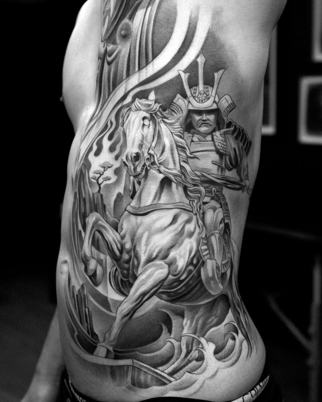
The side-body piece brings a more active figure into the selection. Here, gesture matters as much as surface. The body’s curve changes how the subject is encountered, and the composition has to hold together through that shift. A single photograph can only show part of that relationship, but even the fixed view makes the importance of placement clear.
Cha’s practice also includes painting and sculpture, a connection documented in both his own material and Designboom’s 2019 feature. That doesn’t mean every tattoo should be understood as a sculpture in disguise. The more interesting point is the shared attention to form: where light lands, how a surface turns and what a darker area allows a lighter one to communicate.
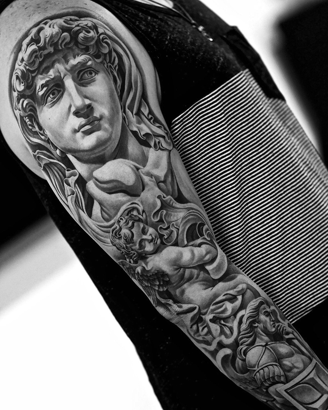
For this carousel, the tattoo photographs stay separate from the sculptures and exhibition images in the source feature. The distinction keeps the focus where it belongs. These are tattoo compositions, not demonstrations that one medium can replace another. What makes them compelling is the translation: the visual weight of carved and modeled forms, reorganized for the proportions of an actual person. Jun Cha’s black and gray doesn’t need color to create scale. It makes light and shadow do the work.
Explore more from Jun Cha on Instagram.