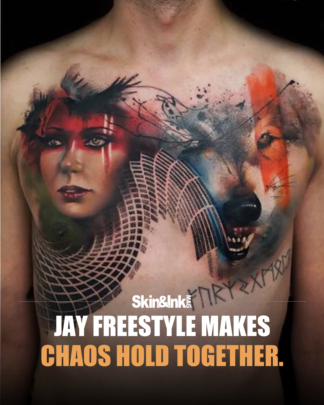
One example in Jay Freestyle’s official portfolio brings together a hand, flowers and a woman’s face. It is a different composition from the woman-and-wolf chest tattoo on this feature’s cover, but it shows the same interest in mixing realistic and graphic treatments.
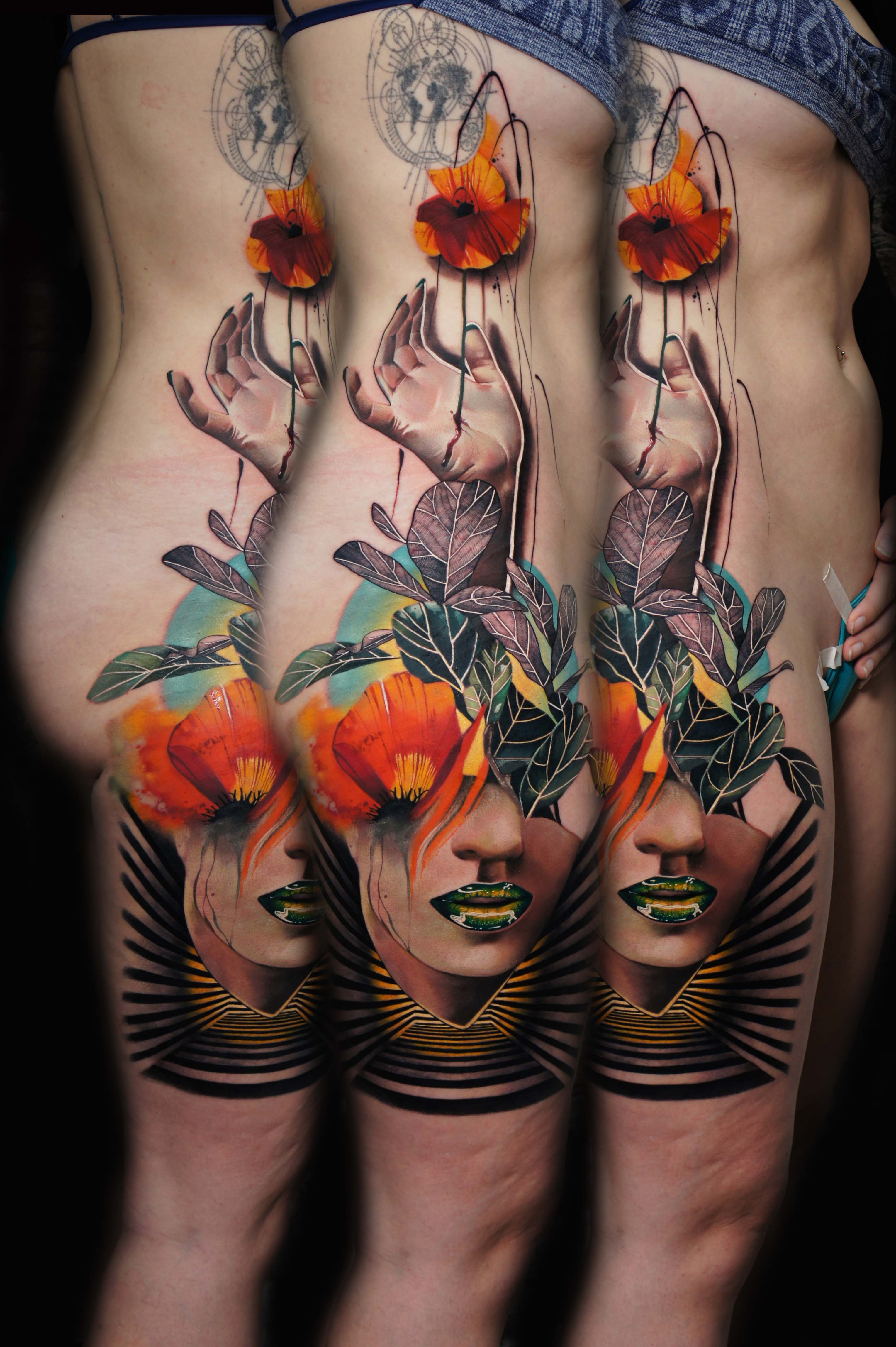
A realistically shaded hand reaches up through a tattoo that refuses to stay realistic. Orange flowers, floating linework, dark leaves and a woman's face share the same long composition. Some elements feel solid enough to touch. Others look like marks left on a drawing board.
That collision is what makes this Jay Freestyle piece worth a closer look.
The photographed tattoo runs along the side of the body. It doesn't treat the available skin like a flat sheet. The hand gives the eye a central gesture, the stems pull it upward, and the face anchors the lower section. Color comes in strong bursts rather than filling every available space. The orange and yellow flowers have room to stand apart from the darker leaves around them.
Then there are the lines. Some belong to recognizable objects. Others travel past them, stretching the composition and interrupting the illusion. You move between a believable hand, flat graphic shapes and loose-looking marks without the tattoo settling into just one category.
A composition like this needs more than a list of objects. The forms have to relate to one another while moving across a surface that curves and changes. That is where the combination starts to feel like one tattoo rather than a group of separate pictures.
What interests me most is the contrast between control and apparent freedom. The design can feel spontaneous, but the placement of its strongest colors is doing deliberate work. So are the dark areas around the face. The piece gives the eye several places to land without making every part equally loud.
The official portfolio photograph of that side-body piece shows the same tattoo from three angles. That matters. Seeing the repeat isn't evidence of three different designs. It is a chance to see how one piece changes as the body turns. Some connections become clearer from the side; others come forward in the more frontal view.
This isn't realism with a few extra splashes added for decoration. The shifts between realistic and graphic treatment are the composition. Take them away and you would lose much of the reason the tattoo holds your attention.
Freestyle's work asks a better question than whether a tattoo looks like a photograph: what else can a believable image become?