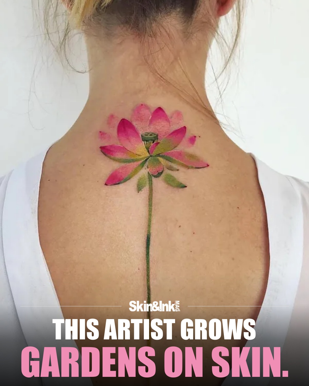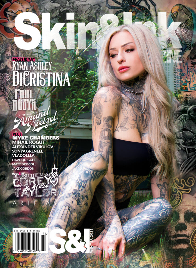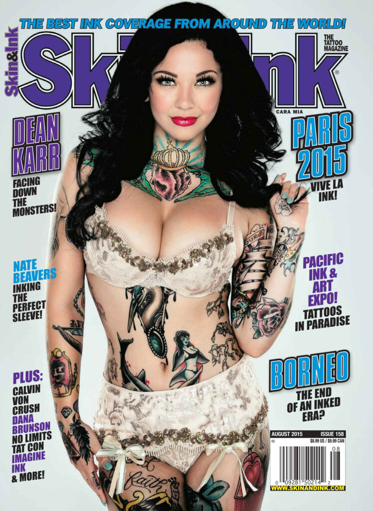
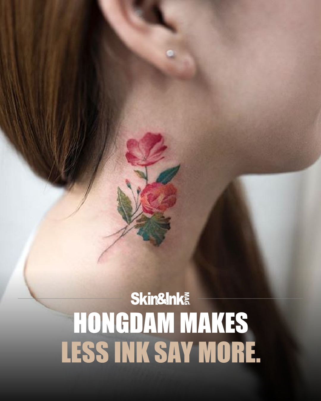
The neck rose on this feature’s cover is one example of Hongdam’s delicate floral work. Another, documented in My Modern Met’s 2016 gallery, puts a rose inside a globe. It is that second piece that caught my attention for the way two familiar images share one outline.
A globe is usually an image of boundaries. Continents, coastlines, divided areas. In this Hongdam tattoo, those boundaries become the frame around a rose.

The flower sits inside the circular design, with pink and purple petals carrying the strongest color. Around it, the land shapes are described through thin outlines and closely spaced dark marks. You can read the world and the bloom at the same time, but neither has been illustrated in the most obvious way.
That is what makes this small piece interesting. The rose isn't sitting beside a map as a separate symbol. It occupies the space inside it. The two subjects share a single outline and become one compact composition.
Hongdam's portfolio has long been associated with fine lines and watercolor-like passages of color. My Modern Met's 2016 feature documents that vocabulary through flowers, trees and other natural imagery. The globe-and-rose example comes from that archival feature, not a newly completed tattoo announcement.
Looking at the design itself, the contrast between line and color does most of the work. The darker map sections have a graphic quality. The rose is softer and more dimensional. Its center pulls the eye inward, while the surrounding shapes keep the whole image from dissolving into a loose patch of pink.
The open skin around the circle is important too. There isn't another large motif trying to explain the first one. The design has enough space to register as a single idea. You see it, then start sorting out its parts.
I like that kind of economy. A tattoo doesn't need a full sleeve's worth of imagery to create a visual relationship. Two familiar things can become more interesting when their borders overlap in a way you aren't expecting.
It would be easy to assign this piece a sweeping message about nature or humanity. Without the wearer's explanation, that would be speculation. What we can see is a deliberate pairing: a flower's folded interior and a map's outer divisions, brought together through a limited palette and a clear shape.
Hongdam makes the contrast feel gentle rather than forced. The linework holds the image together. The color gives it a different emotional temperature. That small shift is enough to make a familiar subject worth another look.